Gift Certificate and Flyer for Orto Mir

The brief
I designed a coordinated print set for Orto Mir: a gift certificate with a flexible amount and an opening flyer for a new retail location. The two formats share one visual system while serving different communication goals.
The approach
The certificate is deliberately functional. The logo and document title establish the hierarchy, a large white field is reserved for the amount, and the two store addresses, phone numbers, and QR code are grouped below. Its landscape format fits naturally into an envelope and is convenient to present as a gift.
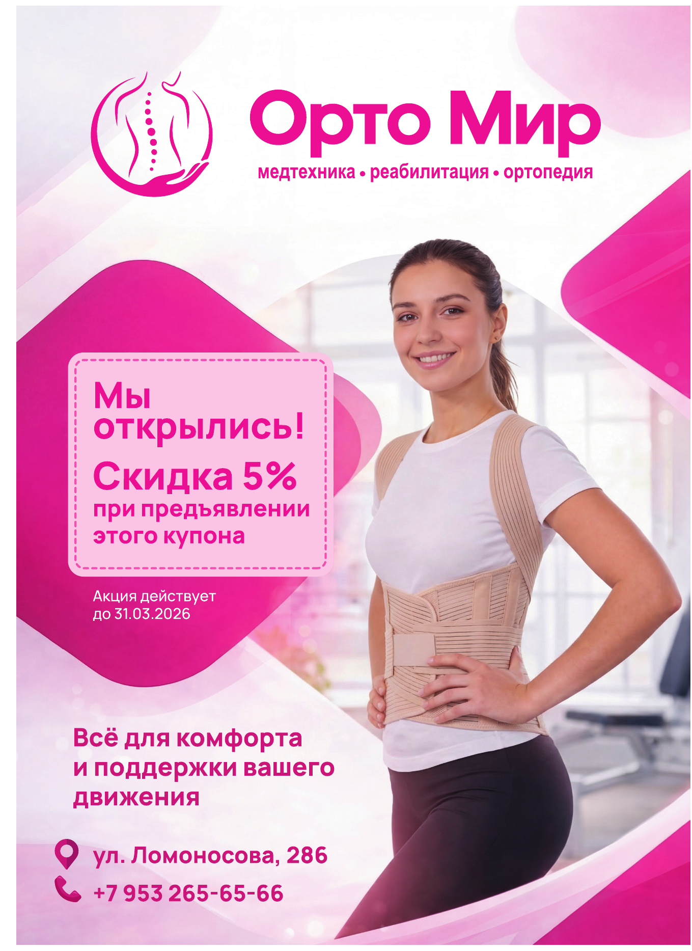
The flyer announces the store opening and a 5% discount when the coupon is presented. A bold pink offer block provides the main focal point, while the image of a person wearing an orthopedic support immediately communicates the store category. The validity date, address, and phone number form clear secondary levels.
Details
Both items are connected by the brand mark, saturated pink accent, and translucent flowing shapes. The background language suggests movement and support, allowing the certificate and flyer to read as parts of one brand communication system.
The case first shows the two pieces together, followed by the certificate and flyer separately at full size.