FLEX Global Logistics — Brand Identity Concept

The brief
I developed the logo and basic business stationery for FLEX Global Logistics, a transport company. The project remains a concept, bringing together the mark, business card, a letterhead study and possible applications of the identity.
The approach
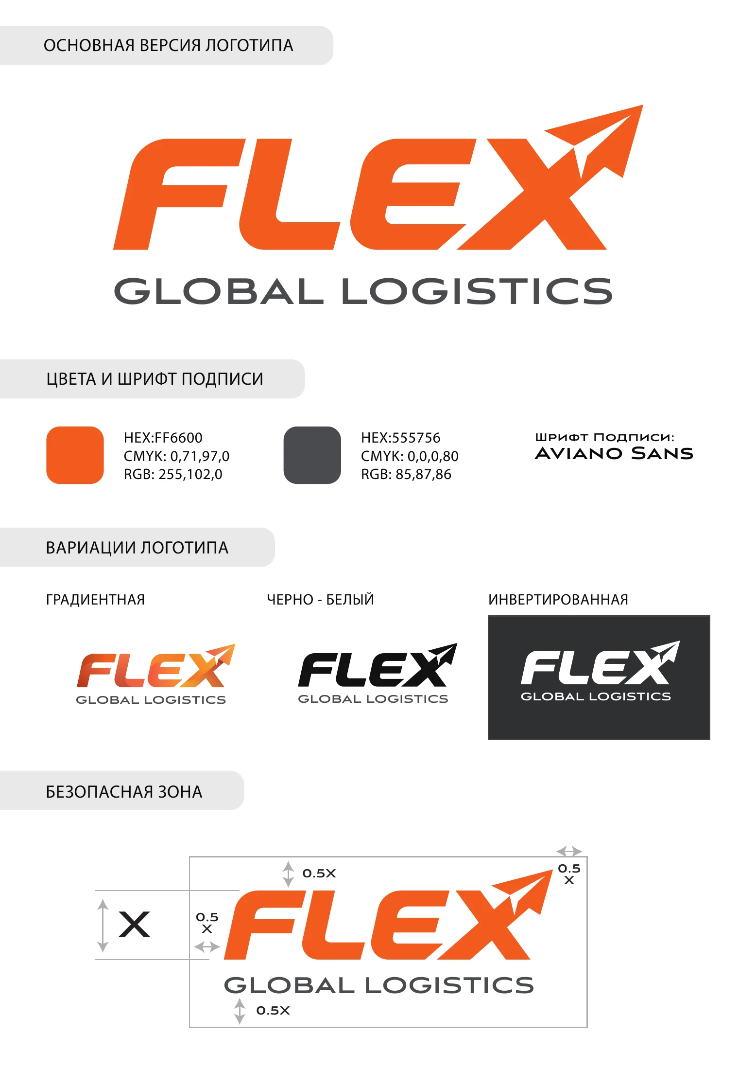
The mark is based on forward-leaning FLEX lettering. The X extends into an upward-right paper airplane, embedding movement in the logo itself rather than adding a separate illustration. The Global Logistics descriptor completes the name.
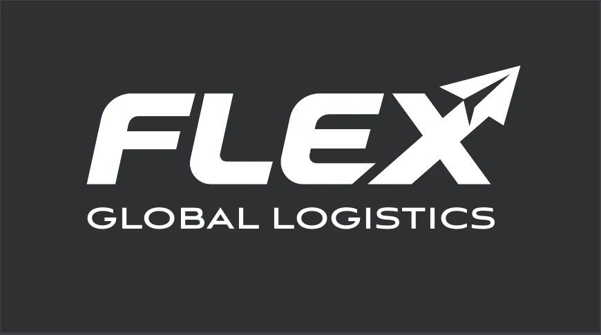
The brand sheet specifies orange #FF6600, grey #555756, logo variants and clear space. The primary mark is accompanied by gradient, monochrome and reversed versions.
Details
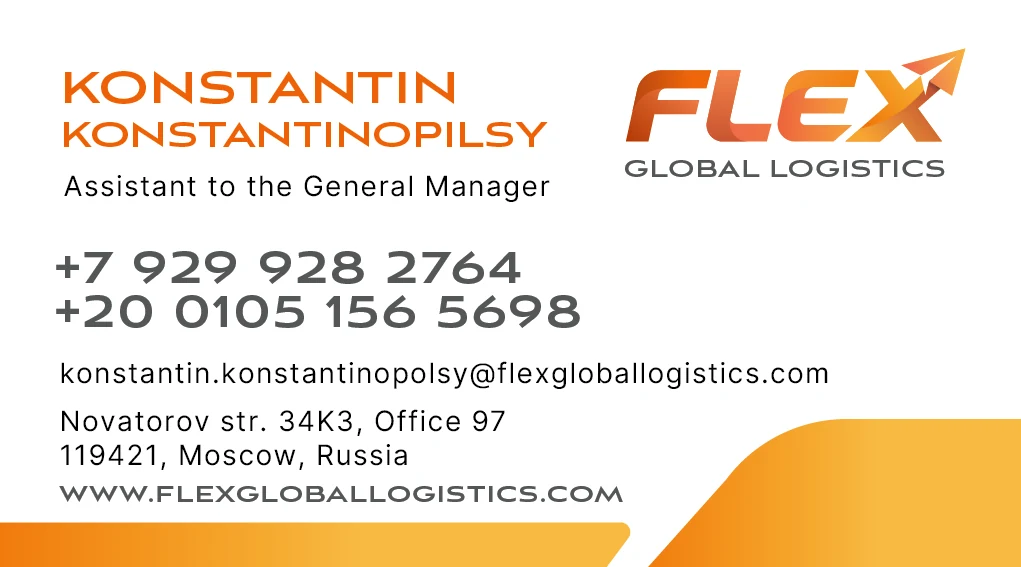
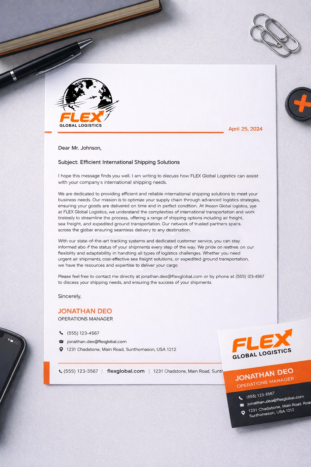
The business card uses a prominent name, clear contact hierarchy, generous white space and an orange accent. The letterhead study retains an earlier logo and is shown separately as part of the development.
For the presentation I applied the mark to an aircraft and a truck. These new images were generated with AI to show possible livery, not an existing fleet or a completed rollout.
Original project materials follow. The demonstration identity and contact details are fictional. No additional company geography, performance or business claims have been added.