Adeon Brand Identity
The brief
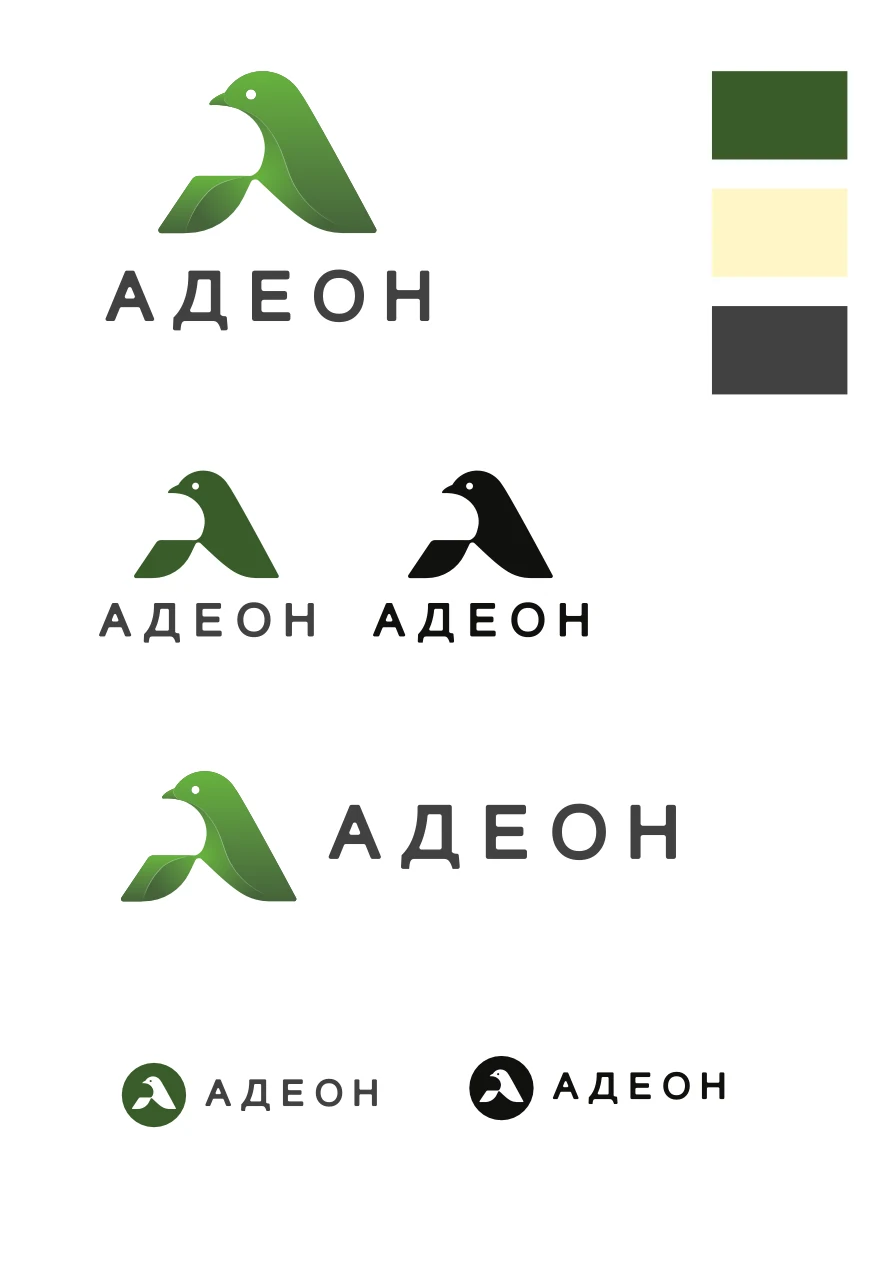
I developed Adeon’s brand identity: the logo, colour and layout variants, business cards and a character for illustrations. The case shows how one visual idea connects business stationery with more expressive communication.
The approach
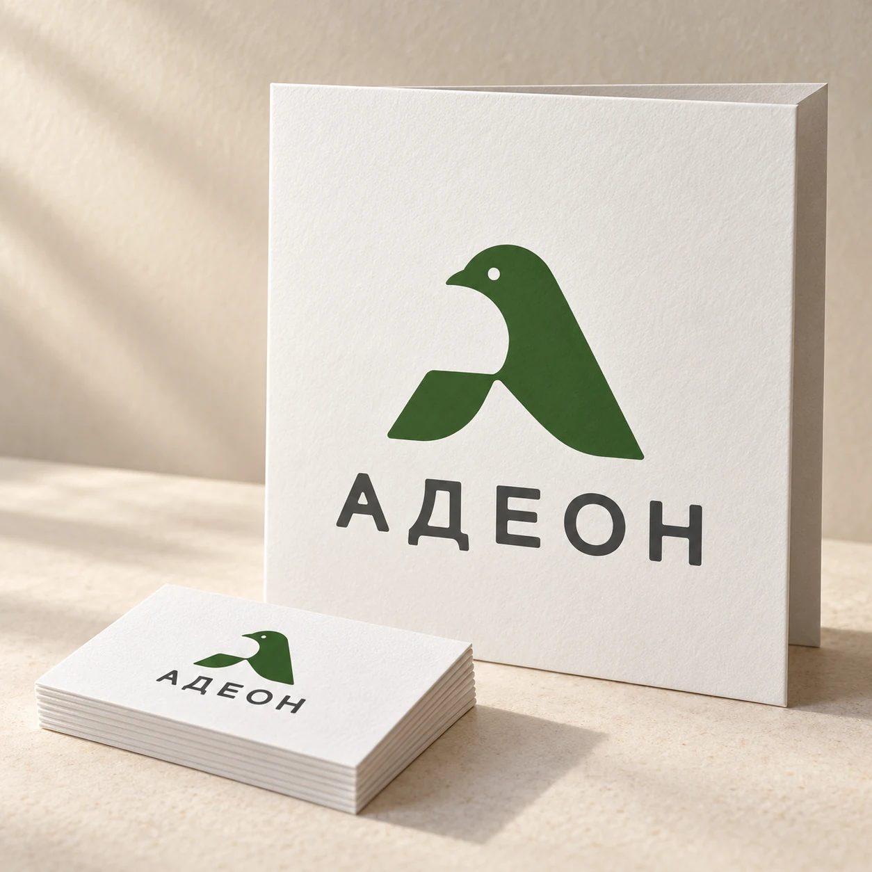
The mark centres on a bird silhouette. Its geometry echoes the letter A, while the white space beneath the head gives it a light, recognisable form. Spaced lettering supports the rhythm of the mark.
Green and dark grey form the core palette, complemented by pale yellow. I prepared gradient, solid-colour and monochrome versions, vertical and horizontal lockups, and a compact circular badge.
Details
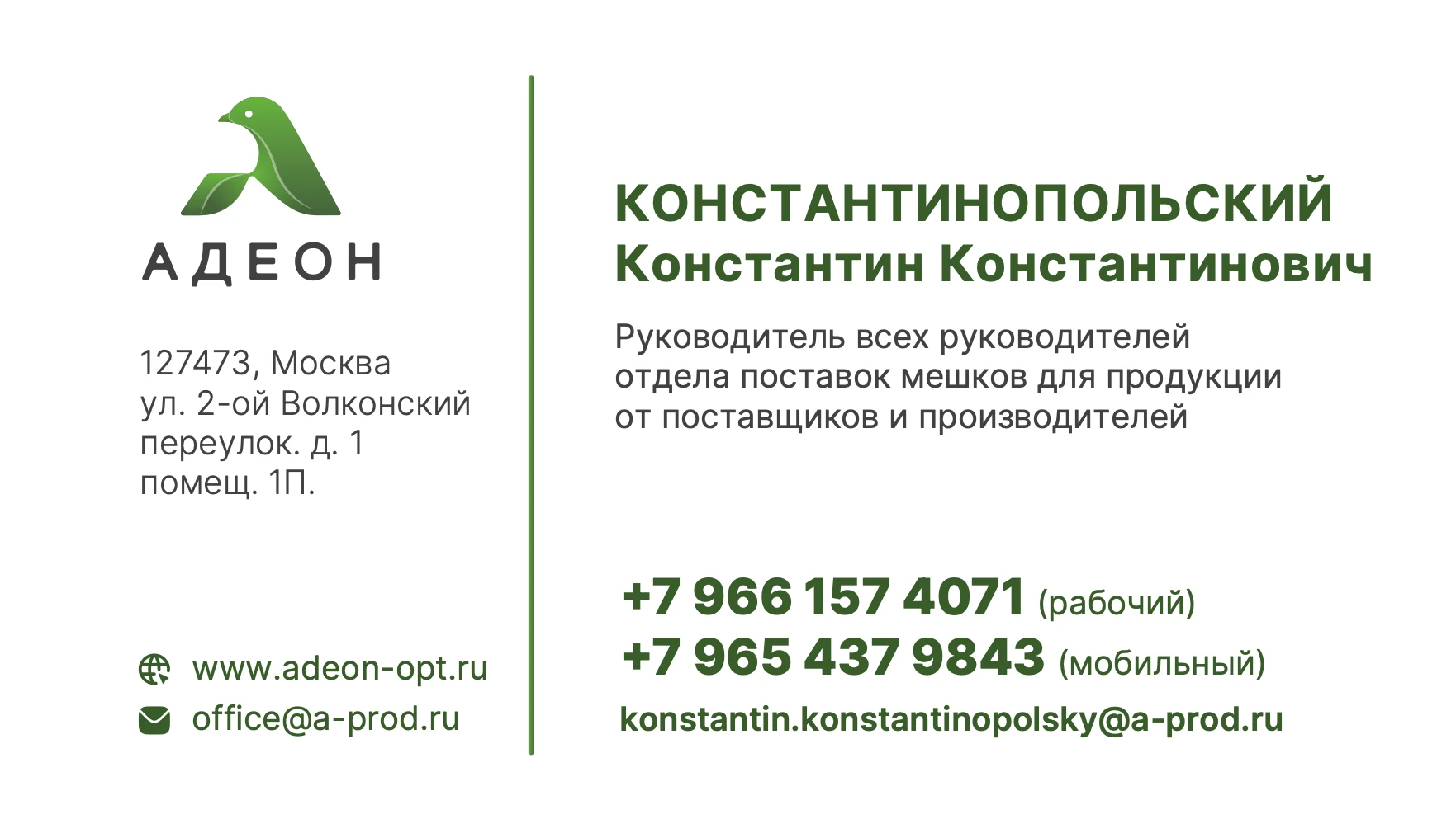
The business cards explore two approaches: a restrained white layout with information in columns, and a more expressive version with an enlarged bird shape on green. The contact hierarchy remains clear in both.
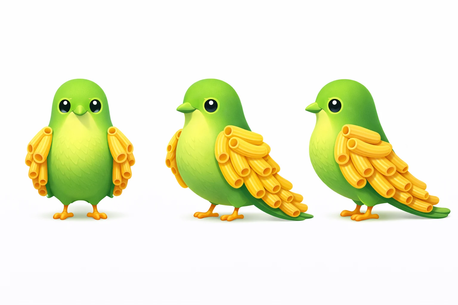
The bird also became a character: a green hero with yellow pasta-shaped wings. A multi-view reference establishes the appearance, while illustrations show delivery, packaging and customer interactions. These are visual narratives rather than documentary photographs of company facilities or vehicles.
The opening image is an AI-generated identity presentation mockup. Original logos, business-card artwork, character reference and illustrations follow. Personal details on the cards form part of the demonstration design.